About Us Newsroom
Advertise on Kwai
English
Download
Brand Resource

Brand Logo
Hello, this is Kwai's Core Brand! We provide guidance and inspiration that help you create the assets, applications and campaigns to bring the Kwai brand to life.
 Download Logo Pack
Logo Elements
Kwai’s logo consists of two elements: the graphical logo and text logo. The relative size and position of its elements are fixed, and the text logo cannot be used alone. The Kwai logo can only be directly copied and used from the final specification document, instead of redrawing or combining without authorization. Various electronic format files of this specification are universally used on Mac or PC.
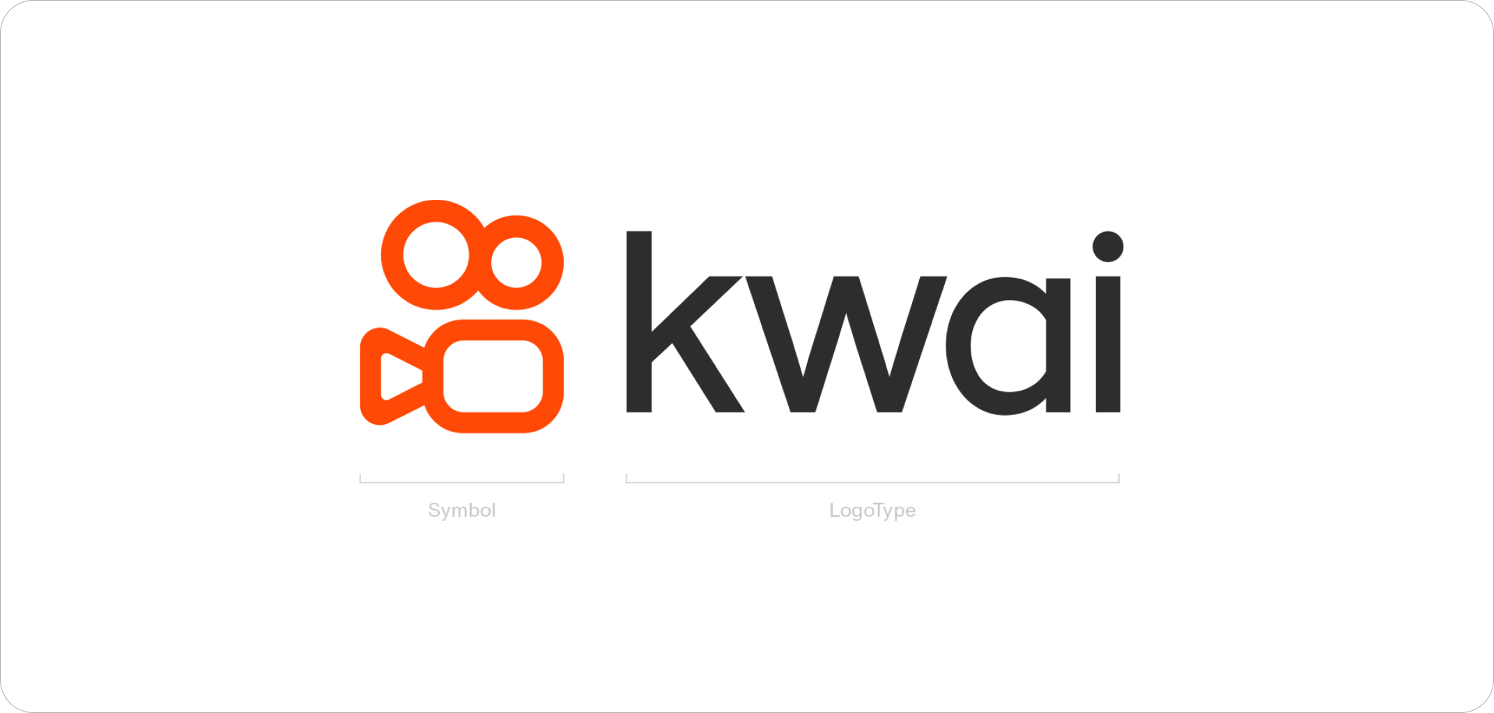
Horizontal Lockup
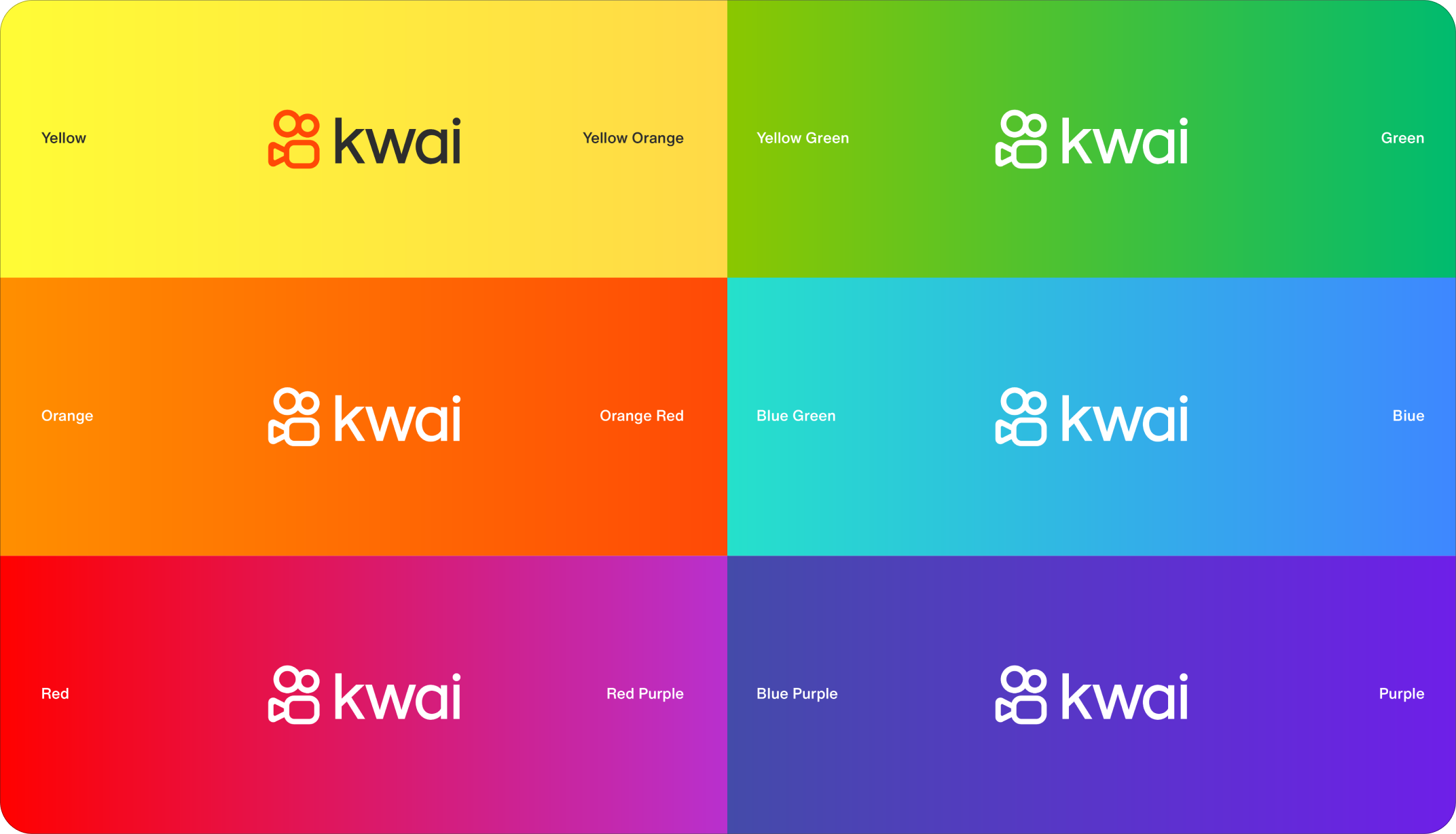
Logo should be white on darker backgrounds and Kwai orange on lighter backgrounds. The horizontal lockup option is our primary and preferred option for most applications.
FAILED

FAILED

To ensure that the Kwai brand logo can be clearly identified in all applications, a certain safe and inviolable area must be reserved around the logo. This area is equivalent to the minimum distance between the logo and other design elements or text content when it is used. To ensure the integrity and readability of the logo, the size of this area must strictly comply with the specification.
When the logo size is scaled and used, the size of the safe area scales proportionally. In general, 100% safe area should be maintained, or when 100% safe area is not available, 50% safe area is the minimum limit situation.
FAILED
Vertical Lockup
The vertical lockup option is our secondary option and best used in tight or vertically oriented applications such as portrait oriented business cards, social icons, 9x16 vertical video, etc.
FAILED

FAILED

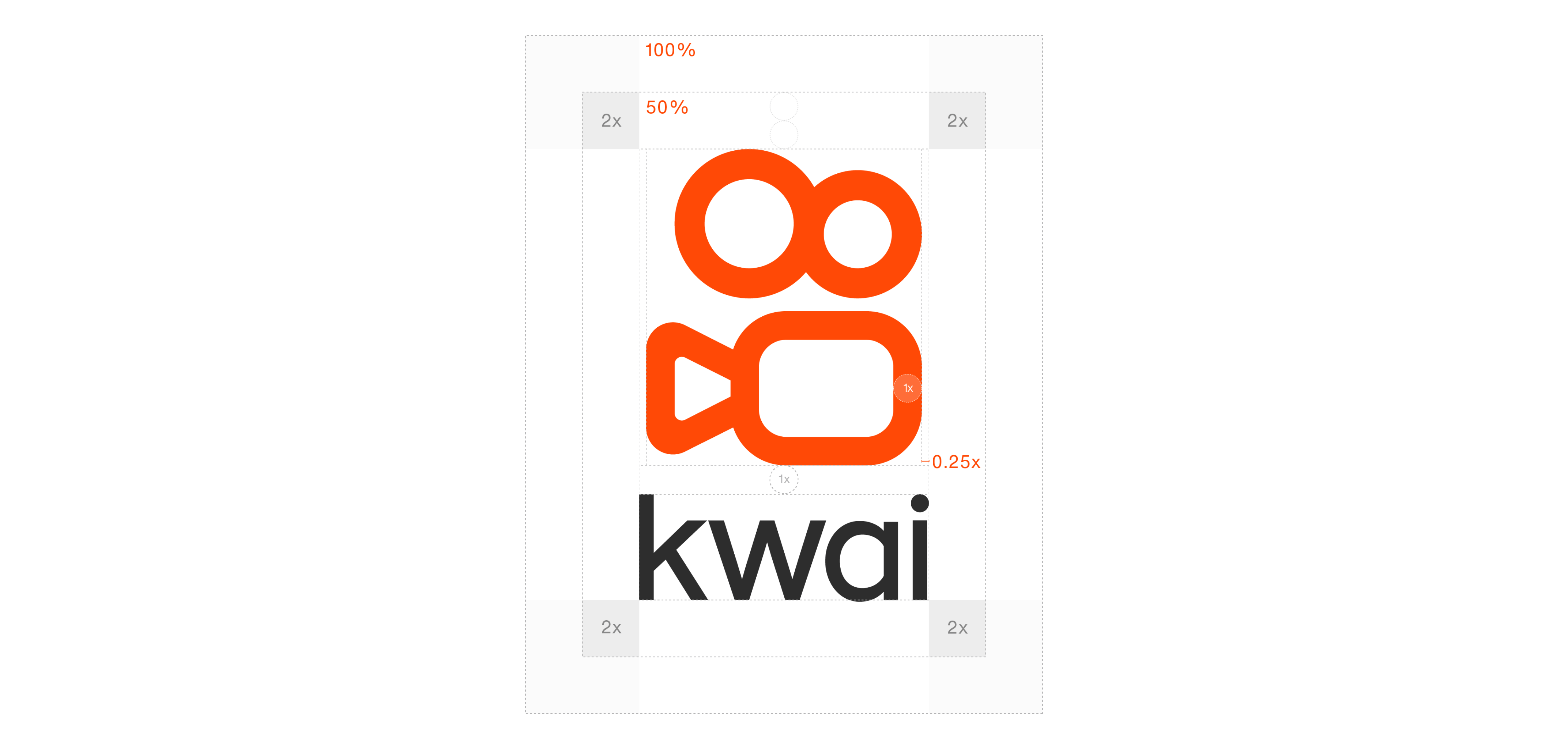
To ensure that the Kwai brand logo can be clearly identified in all applications, a certain safe and inviolable area must be reserved around the logo. This area is equivalent to the minimum distance between the logo and other design elements or text content when it is used. To ensure the integrity and readability of the logo, the size of this area must strictly comply with the specification.
When the logo size is scaled and used, the size of the safe area scales proportionally. In general, 100% safe area should be maintained, or when 100% safe area is not available, 50% safe area is the minimum limit situation.
Slogan
Our brand slogan is Make Everyone Shine. Slogan combination in the form of a fixed style, the height of the slogan letters is 1x, and the spacing between the logo and the slogan is also 1x.
FAILED

FAILED

FAILED

FAILED

FAILED

App Logo
As the corporate logo of Kwai App, the icon occupies an important position in brand identity. It helps to establish brand identity while conveying a brand credibility and stability.
The right side lists the different sizes of icon usage specifications in the app store for mobile terminal. When using the icon, the background color and the logo can not change or be reversed.
FAILED

Favicons
Ensure our icon is visible but has space to breath at small sizes. For small scale use, the icon should be optically centered.
FAILED

Minimum Size
The Kwai logo has no fixed size, and its proportional relationship should be determined by the available space, beauty, functions, and visibility.
And there is no preset maximum size for the Kwai logo. The logo limit printing size width is 15mm. It is recommended that the printing size width is not less than 20mm in general.
In the case of screen display, the maximum application size and width of the horizontal version of the logo is 48px, and it is recommended that the screen display size and width should not be less than 55px in general.
Minimum printing size

Minimum screen display size

Partnership Lockup
Aligning partnership logos should follow clear space rules. The separating line between logos can be created either by the vertical line glyph in the Kwai at the same size as the logo.
Cooperative brand logo typesetting must not exceed the limited range, as shown on the right.
FAILED

FAILED

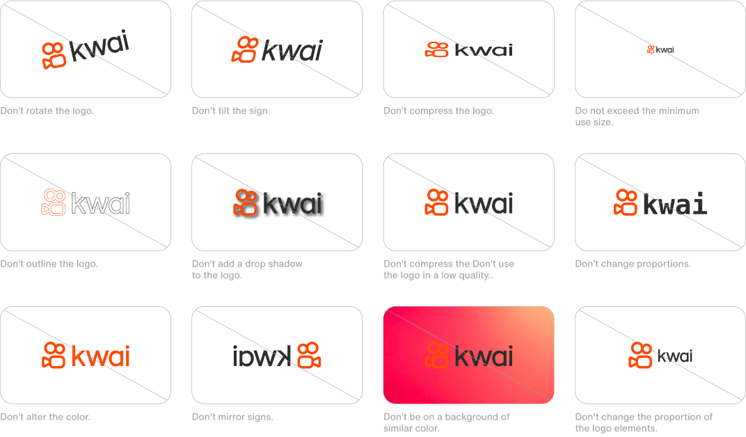
Restrictions
To maintain the integrity of the logo and to promote the consistency of the brand, it is important to use the logo as described in these guidelines. The examples shown here illustrate possible misuse of the logo that should be avoided.
Brand Colors
Color Usage
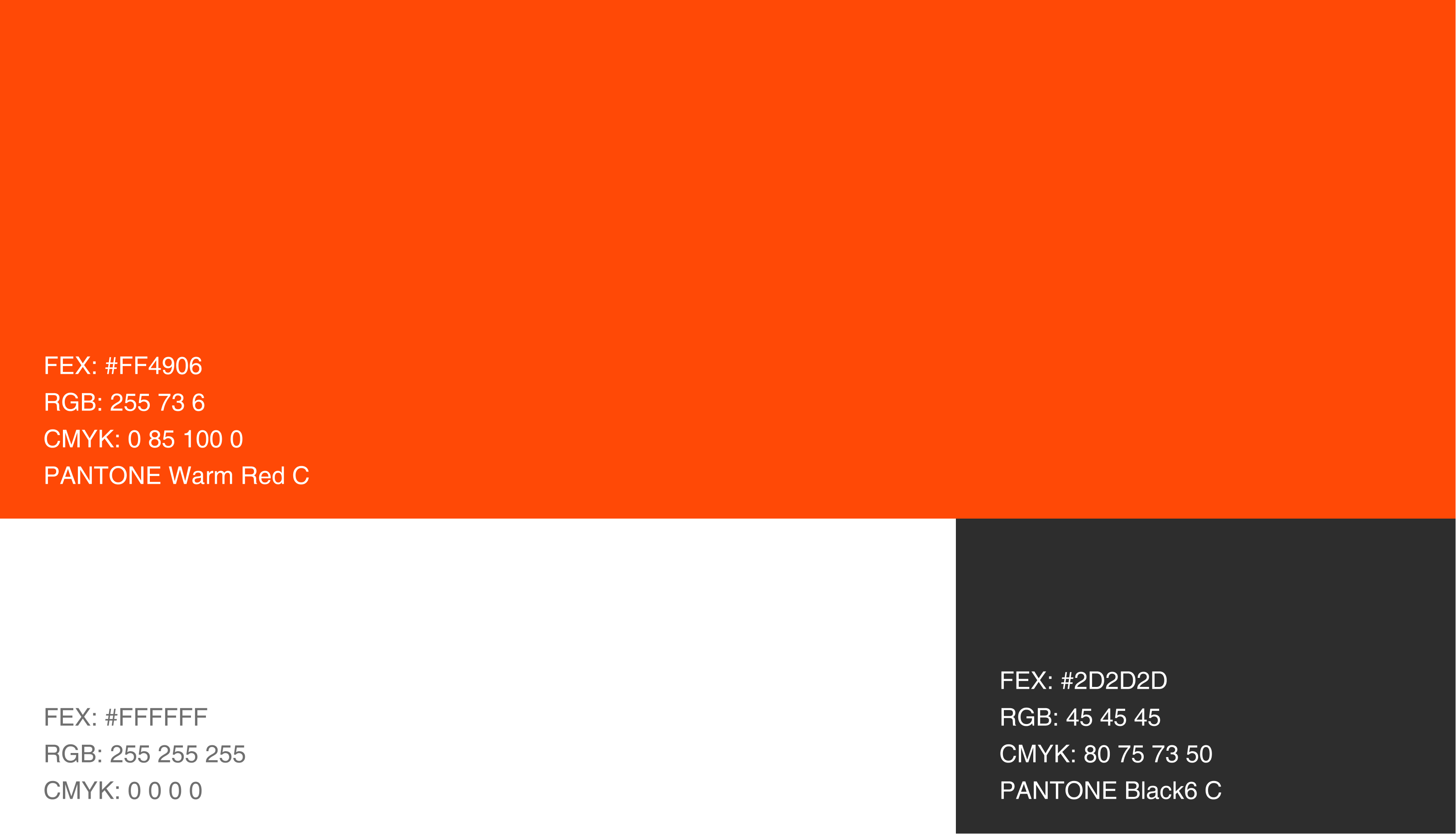
Our colors take advantage of the existing Kwai brand colors that hold brand equity. They are designed to reflect the youthful and contemporary energy of the Kwai brand.
Digital: Use RGB color values for all digital applications.
Print: Use Pantone color values when printing stationery or logo to ensure the correct branding color. Use CMYK color values for all other print applications.
Background Colors
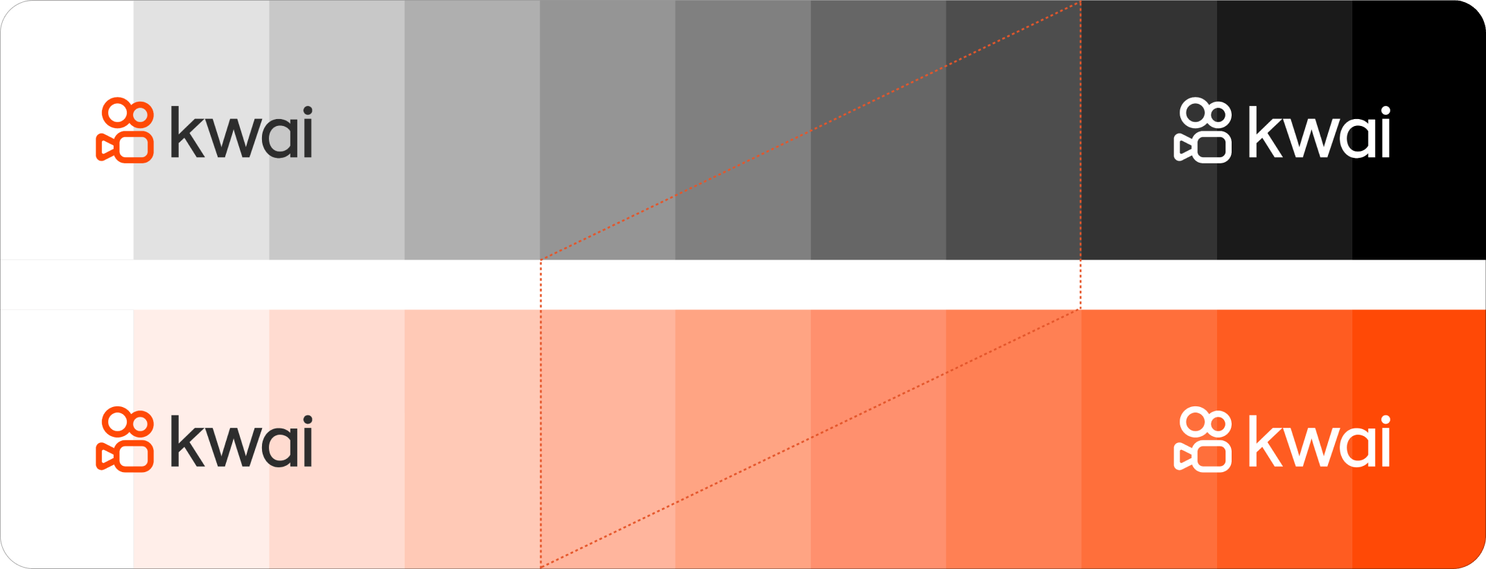
Do not use the logo on a 30% - 60% graycale background.
Background Colors
Use different colors as the background, and the display specification of the logo.
